It's SUNNY and all of the mountains have been out for what feels like weeks. The snow might suck, but I'll take delicious sunsets and afternoon light painting my living room as a consolation prize.
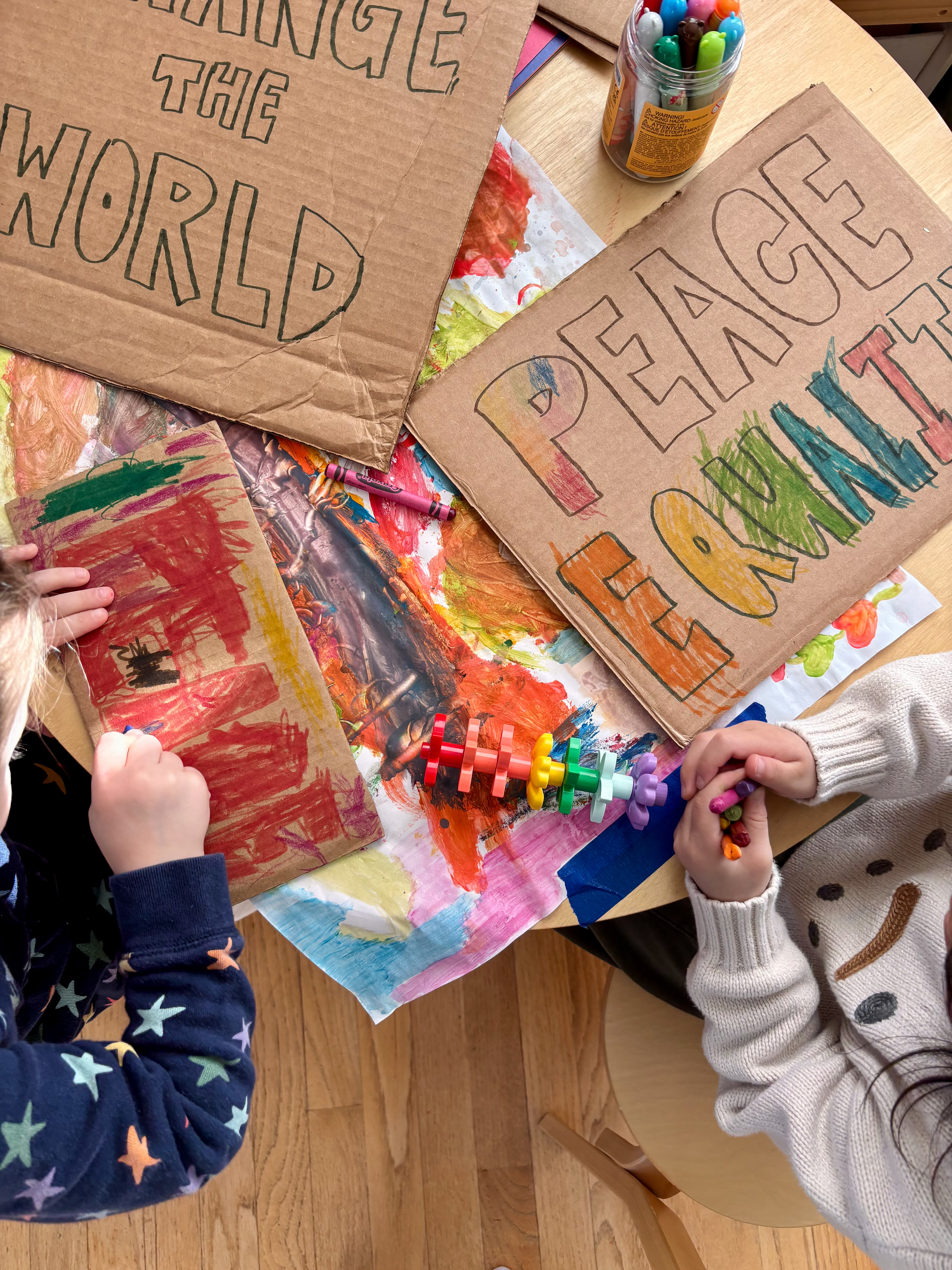
This week started with MLK Jr. Day; a moment of reflection in a time that feels heavier than ever. I took my pair of three-year-olds to a march, which, by the way, is a bold and crazy endeavor for toddlers with no sense of rule-following nor the importance of staying together in a mass of humans thousands strong. We crafted signs beforehand while chatting about peace, equality, love, and change. How does one teach toddlers about the implications of the Civil Rights Movement, much less the contemporary and connected injustices of ICE? I wish I had the answers. What I do have is their innocence-filled signs, a mental image of them gleefully marching while chanting "WE NEED PEACE!" and a reminder that thousands of our neighbors show up.

But to get into the packaging of it all...I chose to highlight a cherry tomato package created by Meteorito Studio, a boutique design firm in Valencia, Spain.
I was initially drawn to the packaging because it's quite different from any competitors. The box marketed more towards kids is cute and fun, while the longer box is orderly and has an heirloom quality from the linocut style of tomato prints.
What’s eye-catching about it? First, the shapes are unique among their peers. Typical cherry tomatoes come in clear plastic clamshells, or in the case of Trader Joes, a flimsy cardboard square with a plastic sheet across the top. Leaning into the green and red color palette of the tomatoes creates an interesting complimentary color scheme. Chunky, all-caps text is giving bold, plump tomatoes.
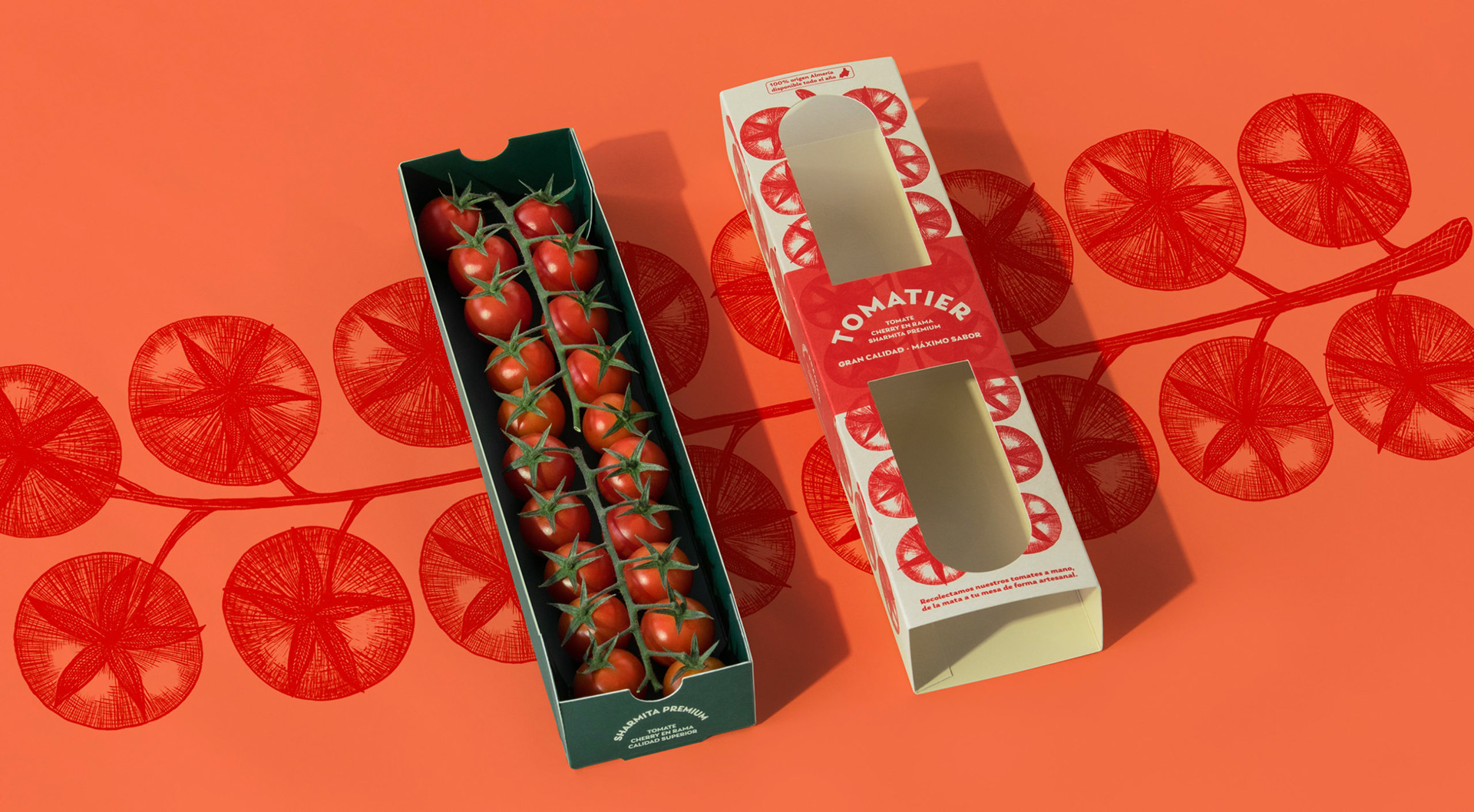
https://meteoritoestudio.com/portfolio/naming-marca-packaging-tomatier/
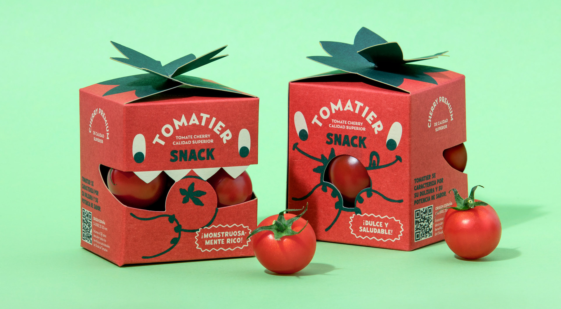
https://meteoritoestudio.com/portfolio/packaging-tomatier-snack/
Meteorito gets into the behind-the-scenes on their site; the friendly monster character reinforces the brand story “Los monstruos molan y los tomates también” or “monsters are cool and so are tomatoes.” Maybe a basic bottom line, but the packaging sure isn’t thanks to cute characters, cut-outs to see the product inside the monster’s mouth, and cute supporting copy like “monstruosamente rico.”
I haven’t physically used this package myself, but the photos appear easy to use: the snack box, designed to be eaten in one sitting, even includes a hole for tiny, uncoordinated kiddo fingers to open the top more easily. The cutesy design elements on the top appear to fold down flat for shipping, but it’s hard to tell how practical those would be in the store…are they popping up on their own when they’re unstacked, or would someone have to manually bend them up? Sustainability wise, though, I would imagine these are better than the usual plastic containers used in the US as cardboard can be more easily recycled.
From a messaging standpoint, it’s pretty obvious what the product is thanks to the color scheme, the peek-through windows to physically see the product, and the shape/supporting imagery.
It makes sense to me that this package, specifically the kids’ version, won several awards including the 2025 Best in Food Awards for Best Packaging.